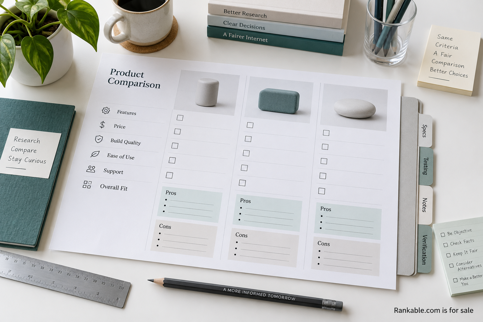
A review page asks a reader to rely on someone else’s judgment. The reader may be deciding where to spend money, which supplier to contact, or what product to investigate next. A polished table can help, but the page also needs to answer a quieter question: how did these conclusions get here?
The following is an editorial template audit, not a set of claims about particular products. It focuses on making evidence and judgment understandable. Start with one existing page or a draft comparison. Work through the decisions below before adding badges, scores, or another row of recommended options.
State who the comparison serves
A broad headline such as “best tools” can hide several different customer situations. A small team choosing its first system has different needs from an established operator replacing a deeply integrated product. Name the intended reader near the beginning. Include the constraints that materially affect the comparison, such as team size, region, or required capabilities.
Explain what the page covers and what it leaves for another guide. A limited scope is useful when it reflects a real decision. It becomes misleading when the headline implies a complete market review and the body quietly covers only a few available options. Make the scope visible before the reader reaches the ordered list.
Label the basis of each judgment
Separate firsthand testing, document review, interviews, and provider-supplied information. A product specification can establish that a feature is advertised; it does not establish how well the feature works in practice. A customer interview can reveal a real experience without representing every customer. Keep those distinctions close to the claim.
Google’s review guidance emphasizes evidence of experience and useful decision factors. For a working editorial team, that suggests a practical question: what can the reader inspect that supports this statement? The answer might be a documented test, a source link, or a clearly described research method. A confident tone is not a substitute.
Give scores a readable explanation
If the page uses a score, state what goes into it. Explain the scale, the criteria, and any weights that materially affect the result. Identify whether a field is observed, estimated, or judged by an editor. A decimal number can look precise even when the underlying assessment is subjective. Use only as much numerical detail as the method can reasonably support.
Consider whether an overall score is necessary. A product may be strong for one use and unsuitable for another. A set of plainly described tradeoffs can be more useful than a single total. If the team keeps a total, show enough detail for a reader to understand why a different priority might lead to a different choice.
Put disclosures beside the decision
A commercial relationship should be visible where it matters. If a link can generate revenue, explain that near the recommendation or link area. If a listing is sponsored, label the listing. If payment changes placement, say how. A distant policy may provide additional detail, but readers should not need to leave the comparison to understand its basic commercial context.
The wording should be direct. Describe the relationship and its effect on the page. Avoid vague phrases that suggest transparency while leaving the actual arrangement unclear. These are editorial design principles; an operator should separately assess the requirements that apply to its market and business model before publication.
Show the limits of the research
Every comparison has boundaries. The team may have tested a particular plan, used the product for a limited period, or been unable to verify a field. State those limits in the relevant section. A missing test should remain a missing test, rather than becoming a favorable assumption or a silent penalty.
Keep a research date for information likely to change. A feature description, support policy, or contract term may become outdated. The date should indicate what was actually checked, not simply when a publishing system last saved the page. If only one section was updated, make that distinction available in a change note.
Work through an illustrative recommendation
Imagine a fictional comparison of scheduling tools for a small field-service team. The reader needs mobile access, a way to assign jobs, and a clear record of changes. One tool supports a complex approval process; another is simpler to set up. The review should explain which situation favors each option rather than declaring that more features automatically make a better product.
A useful entry could contain “Suitable when,” “Check before choosing,” and “Evidence reviewed.” The first describes the customer situation. The second names a material tradeoff or unanswered question. The third explains how the reviewer reached the assessment. This structure helps the reader prepare a trial or supplier conversation, even if they choose an option outside the guide.
Make the table usable beyond a screenshot
Comparison tables need readable headers and a sensible order. Keep related fields together, use consistent units, and explain abbreviations. On a small screen, preserve the connection between the option and its attributes. A horizontal scroll area may work if it is obvious and keyboard accessible; a stacked view may be better for a short comparison.
The W3C tables tutorial explains how to associate data cells with headers. Apply those relationships in the actual page rather than relying on visual alignment alone. A reader using assistive technology needs the same context as someone scanning the columns. Accessibility is part of making evidence inspectable.
Provide a correction route
A provider or reader should be able to report a specific error. Ask for the relevant passage and supporting information. Separate factual corrections from requests to change an opinion or buy a higher position. Keep an internal record of the decision, and publish a note when a material correction changes the comparison.
Decide who reviews disputes before they arrive. An editor should know when to seek additional evidence and when a commercial colleague must step aside. The correction process should remain available to organizations that have no business relationship with the publisher. Otherwise, the page risks becoming more responsive to revenue than to accuracy.
Audit the first screen and the final recommendation
Review the page in two passes. On the first screen, check whether the reader can identify the audience, scope, and commercial context. At the final recommendation, check whether the reader can understand the reasoning, important limitations, and next step. Those two points often carry more decision weight than the longest middle section.
Finish by asking someone unfamiliar with the page to explain why the top option appears first. If they can only say that it has the highest score, the method may still be too hidden. The aim is a reader who can make an informed choice, including a choice to disagree with the recommendation. Audit one template for that outcome before expanding the publication’s review library.